Deem Finance
A Strategic UX prototype of a business loan journey that sealed the deal
About the Project
This project involved designing a comprehensive digital business loan journey tailored specifically for the UAE market. The goal was to create an intuitive, compliant, and trustworthy user experience that reflects regional banking standards and local user needs. The interactive Figma prototype became the core of our sales pitch and successfully secured the client.
My Role
Lead Designer
Timeline
1 week sprint
Screens designed
30+
Tool
Figma
Why the UAE Market is Unique
-
Multilingual users (Arabic + English UI)
-
Document-heavy processes with local formats
-
Strict KYC/AML compliance
-
Mobile-first behavior, but with demand for desktop portals
"The goal was to demonstrate how we’d approach a localized business loan experience for the UAE. This wasn’t just about UI — it was about trust, compliance, and flow."
Reserch & Discovery
Before jumping into design, I worked closely with stakeholders to understand:
-
User personas: Small business owners across the UAE with varying tech proficiency
-
Regulatory requirements: Mandatory fields, document types, and verification steps
-
Competitive landscape: How other UAE banks and fintechs approach digital lending
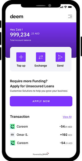
The Solution: UX Strategy
1. Pre-Qualification:
-
Quick eligibility check using Emirate ID and business license input
-
Clear feedback on eligibility to reduce user frustration
-
The offer screen that displays key loan details like max amount, EMI, and interest rate - all at a glance.
2. Application Form:
-
Multi - step form with Progress indicators
-
Conditional fields based on business type and loan purpose
-
Real-time inline Validation to prevent errors
3. Document Upload:
-
Drag-and-drop functionality for ease of use
-
Supported formats clearly indicated
-
Upload progress and secure messaging for peace of mind
4. Application Status:
-
Loan timeline
-
Approval status
-
Help center CTA
Design System
The typography and color palette are carefully selected to align with the brand’s design principles, ensuring consistency and a cohesive visual identity. The typography enhances readability and brand recognition, while the color palette reflects the brand's values and resonates with the target audience, creating a unified and professional look.
#7E35FB
#000000
Visual Highlights
.png)
.png)
A clean, intuitive onboarding and document scanning experience designed to reduce friction and prevent user fatigue
A streamlined input experience paired with a contextual video prompt - designed to simplify data entry, reduce user friction, and boost confidence through clear guidance.


Clear, minimal design for a seamless journey - personalized offers presented with clarity, followed by an effortless, guided document upload experience.
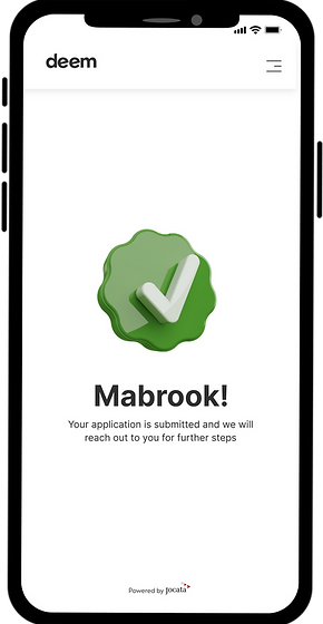
A smooth transition from approval to confirmation - users receive a clear digital sanction followed by a celebratory “Mabrook!” (Arabic for congratulations), reinforcing trust and guiding next steps effortlessly.


Takeaway
Designing fintech flows in the MENA region means combining clarity with cultural empathy. This project taught me the power of small moments - like a well - placed "Mabrook!"—in making digital experiences feel personal and human.